Accessibility
Accessibility Instructional Videos
Many resources are available on the Intranet that provide instructions on creating accessible documents. This page contains links to several short videos that cover some of the essentials and a website with comprehensive information about creating content accessible to everyone.
Section508.gov
The General Services Administration’s Office of Government-wide Policy created the Government-wide IT Accessibility Program to focus on providing support to federal agencies. Through its Section508.gov website, it features a comprehensive collection of instructional materials to assist government agencies to create accessible materials. MPO staff have curated videos from the website listed below that may help you create your materials.
- Module 1: Save as a Word Document (.docx) with a Descriptive Filename
- Module 2: Use Styles to Create Headings
- Module 7: Create Unambiguous Names for Links
- Module 9: Create Accessible Images and Other Objects
- Module 11: Use Color and Other Sensory Characteristics Plus Text to Convey Meaning
- Module 13: Create Accessible Embedded Files (appropriate to Storymaps)
Document Accessibility Top Tips
There are many resources to help you produce accessible documents, including those created by MPO staff on the intranet. Below are some tips to assist you with your document creation. If you need more assistance, see the Document Production Guidebook (PDF) for specific instructions.
The top, top tip
Get to know Accessibility Checkers. Microsoft Word, PowerPoint, and Excel all have a built-in tool that scans content to identify potential barriers for people with disabilities. Using an Accessibility Checker is an effective way to get a rapid assessment of your document’s accessibility status and learn about available solutions.
Word
- Add alt text to visuals. Avoid using text in images as the sole method of conveying important information. If you must use an image with text in it, repeat that text in the document.
- Use style sheets, which are predetermined sets of consistent formatting that a user applies to text to control the visual appearance and behavior.
- Use the Navigation pane to check heading formats.
- Do not use color alone to convey information.
PowerPoint
- Give each slide a title. A title can be given that is not visible, which can allow a screen reader to read a title for the listener.
- Use a larger font size (18pt or larger), sans serif fonts, and sufficient white space.
- Set the reading order.
- Do not use color as the only meaningful difference between two ideas, or concepts; consider using patterns instead of solid colors in bar charts as a differentiator.
Excel
- Give all spreadsheets a unique name and remove blank worksheets.
- Ensure that there is text in Cell A1, where screen readers start reading.
- Create simple tables; avoid complex tables whenever possible.
- Avoid merging cells.
- Create Adobe forms or forms saved as Adobe products that allow navigation via tabbing rather than with a mouse.
- Accessibility should begin in the native format.
- Set security settings (restrictions from printing, copying, etc.) so they do not interfere with a screen reader’s ability to convert text to speech or Braille.
- Avoid images that contain text because they will not be read on screen readers.
GoogleDocs (Internal Use)
- Use text styles to support formatting. It is best not to rely on visual formatting alone to communicate meaning.
- Screen readers might not announce formatting changes, such as boldface or highlighting. For example, to mark an important section of text, add the word “Important.”
- Include alt text for graphics.
- Check for readable color contrast using WebAIM contrast checker or Accessible Web Color Contrast Checker.
- Use left-aligned text rather than justified text.
- Use captions.
Document Accessibility Guide: Template Process
Using accessible templates allows for consistent style across the organization. Another advantage of templates is having built-in accessibility and structure for authors. The consistency of templates is especially useful when documents are created collaboratively in Google Docs and later transferred to Microsoft Word.
As there are periodic updates to Microsoft 365 products, it is important to expect at least a yearly review of the document templates by the Template Committee to ensure that they hold to accessibility standards.
Document Accessibility Guide: Document Language
Setting the document language helps screen readers pronounce words correctly. The language should be set to English (US) on the templates. When exporting a Word document to a PDF, the language should automatically transfer.
In Microsoft 365 applications like Word and PowerPoint, users can change the language setting at the bottom of the application, beside the current page and word count. Click on the language. A modal window will appear and allow you to change the document language.

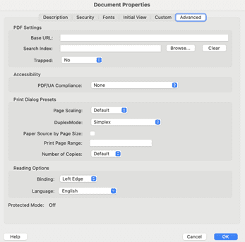
In Adobe PDF, if the language has not been set in the previous application, the Accessibility Checker will flag this as an error. Users can change the document language in Adobe by going to File > Properties > Advanced tab panel. Under “Reading Option,” there is a Language drop-down menu. Here, select English.
Document Accessibility Guide: Reading Order and Tab Order
Reading and tab order refers to the visual and structural navigation of a document. English and other Western languages are read from left to right, top to bottom. Screen-reader users from Western cultures also read this way, so it is important that documents are structured in a way that makes sense. When using a screen reader to navigate through a document, the user should be able to read through in sequential order.
Who is responsible for document reading order?
Authors and editors can both help to make sure documents have a reading order that makes sense. Authors should use agency templates, which are formatted with Word’s built-in style tools. The Graphics team can help by checking and tagging the accessible reading order in PDF documents.
When the Word documents are ready to be converted to PDF format, you can use the Save to Adobe PDF ribbon in the top toolbar. This will ensure that the semantic structures are transferred into the PDF and will improve the default reading and tab order.
What are the differences between applications?
Sometimes when you turn a Word document into a PDF, the reading order gets scrambled. You can use Adobe Acrobat Pro to edit the reading order so that it makes sense.
- Locate the Accessibility tools.
- After selecting the accessibility checker, users can go to the tags panel and review how the document is structured.
- Use the Reading Order tool to build in a reading order structure that may not have carried over from Word.
PowerPoint
PowerPoint’s Accessibility Checker has a Reading Order Pane. This is a side panel where you can check and adjust the reading order of your presentation. To open the Reading Order Pane, select Review, Accessibility Checker, and Reading Order Pane. This enables you to see the presentation information the way a screen-reader user would.
Note: There are differences in creating accessible PowerPoints by operating system. If you are using a Mac, the section pane will display slide content in reverse order, and a screen reader will read objects in the order they are listed from bottom to top. Here is a good breakdown of PowerPoint accessibility by OS. For a detailed demonstration, here is a good how-to video on checking PowerPoint reading order.
Excel
To preserve proper reading order in an Excel document:
- Make sure that the content starts in cell A1 and goes from left to right and top to bottom. Readers should be able to use the arrow keys on their keyboard to follow this reading order.
- Avoid spanning content over multiple columns or rows.
Document Accessibility Guide: Links and Labels
A link label is the text part of a hyperlink that explains where the link leads. Make sure that any links in your document have detailed labels. Avoid using vague labels like “click here.” If your report is going to be printed out as well as displayed on the web, it is good practice to also include the full hyperlink for those reading the print document.
Screen-reader users are able to look at lists of links within a document at once. They can choose to quickly navigate from link to link. If a link label only says, “click here,” or “read more,” the user will have no idea where the link leads. Document authors should choose clear labels, such as “Read our 2024 stormwater report” or “Read more about bike lanes.”
Word and PowerPoint
- To turn text into a link in Microsoft Word, highlight the text of the link label and press Control + K (Command + K for Mac).
- Next, paste the hyperlink into the Address field.
- To add a label to a hyperlink, paste your hyperlink into the document. Then highlight the hyperlink and press Control + K (Command + K for Mac).
- Next, enter your link label in the Text to Display field.
Excel
In Excel, you can also use the Control + K command (Command + K for Mac) to open the hyperlink window. However, instead of highlighting the text or link, you must click on the cell that contains the text or link.
Google Docs
Google Docs also uses the Control + K (Command + K for Mac) command to turn text into a hyperlink. Use the same methods as described above for Microsoft Word and PowerPoint. If you download your Google Doc as a Word document, the link and link label will be preserved.
Document Accessibility Guide: Sensory-Based Information
This is a new addition to the 2017 version of Section 508. According to the WCAG 2.1 Understanding documents, “Instructions provided for understanding and operating content do not rely solely on sensory characteristics of components such as shape, color, size, visual location, orientation, or sound.”
This guideline applies to instructions for understanding, for example, avoid “The blue column is for the number of people who rode the T last year” or “Choose the button on the left.” Provide additional ways to get this information across.
This criterion applies to all types of documents, no matter what software is used to create them.
Color Alone
Colors carry a lot of meaning, but some people with vision disabilities cannot distinguish different colors. For example, red and green are often used to convey information. However, they can be a problem because they are difficult for many people to see. A color-blind person, for instance, may struggle to tell them apart.
For this reason, color shouldn’t be the only way to convey information. A stop sign is a good example of a design that doesn’t rely on color alone. The sign is colored red, but it is also shaped like an octagon. It has the word “Stop” on it. The color red isn’t the only way that information is shared.
This is good to keep in mind when creating bar charts, graphs, and other informational graphics with color. Including different shapes or patterned backgrounds along with colors adds information that people with color blindness can understand.
Document Accessibility Guide: Built-in Semantic Structures
What are semantic structures?
In the world of document accessibility, the term “semantic structures” is a way to describe hidden instructions for screen readers. These instructions tell screen readers whether they are reading a list, table, block quote, reference, or heading, and screen readers recognize them automatically. When used properly, semantic structures help screen-reader users tell the difference between normal body text, headings, block quotes, tables, references, and lists — anything that “looks different” to sighted users.
Who is responsible for using built-in semantic structures?
At our agency, the Template Committee is responsible for defining heading structure styles in the template documents. However, authors are responsible for formatting and using built-in semantic structures when creating publications that align with the templates. Getting in the habit of using these structures makes creating accessible documents easier in the long run, and may help save time and money later if changes must be made to the documents and templates.
Lists
Lists are an example of a structure that stands out clearly to sighted people, who can see the bullets in an unordered list or numbers in an ordered one. A sighted reader can see where the list begins and ends.
Screen-reader users cannot understand the list the same way unless authors build their lists
- using the customizable built-in list styles in Microsoft Word and PowerPoint, or
- using list tags in an Adobe PDF document.
For example, if you create an unordered list with plain dashes, a screen reader will just read “dash” and then the list item. A screen reader will read the following list:
-eggs
-milk
-juice
as “dash eggs dash milk dash juice.”
However, if you create a list with the built-in semantic structures in Microsoft Word or PowerPoint
- the screen reader understands the hidden instructions to read it as a list,
- it tells the user how many items are in the list, and
- it tells the user when they are inside the list and when they leave the list.
This is all helpful information for people who are blind or have low vision.
When you start creating a list with letters or numbers, Microsoft Word and PowerPoint recognize what you are doing and will help you create lists automatically.
PDFs must be checked and tagged manually if the software does not recognize a list.
Google Docs
Google Docs lists do not carry over well into Microsoft Word. If you create a list using the built-in list tool in Google Docs, you will probably have to redo the list in Microsoft Word when you download your work.
Headings
Reports and other long documents are often divided into sections with headings at the top. A good heading gives a brief description of the content beneath it so that readers understand what the section is about. Sighted users can scan through headings to quickly find the parts of the document they are looking for because
- heading text is usually larger than body text;
- heading text may also be bolded; and
- large, bold headings stand out clearly to sighted users.
A blind or low-vision user may not be able to see the difference between a large bold heading and smaller body text. Instead, they listen to their screen readers, which pick up on hidden semantic information that identifies section headings. Therefore, it is important for authors to create semantic headings using the built-in tools in Microsoft Word and PowerPoint.
Nesting
Headings use a “nesting order” that starts at level 1. Heading level 1 (H1) is usually reserved for the title of the document. A level 1 heading is typically the largest on the page. It may use a different typeface from the rest of the document to make it stand out.
Heading level 2 (H2) is the subheading below H1. H2 is usually smaller than H1.
Additional subheadings for subsections may be at level 3, 4, and so on.
Important:
When creating headings, always use the built-in heading styles tool in Microsoft Word and PowerPoint. If you just change the text appearance of headings without the styles tool, screen readers will not recognize your headings.
- It is best practice to aim for one H1 heading per document.
- It is best practice to avoid using the “Title” heading style because it does not transfer well to other formats.
- Have consistent visual heading styles for those same semantic headings levels. For example, all level 2 headings should look the same. All level 3 headings should look the same, etc.
- Customize the heading style tool based on agency specifications.
In Adobe PDF documents, an editor must use Acrobat Pro accessibility tools and check all the headings to make sure they have the appropriate headings tags. Otherwise, screen readers will not be able to recognize the headings.
Excel
While spreadsheets typically do not have headings because they are usually not long text documents with different sections, authors can add headings or “section levels” to Excel spreadsheets using the Cell Style Tool. This may help screen-reader users navigate through complex spreadsheets.
Google Docs and Headings
Google Docs has a heading style tool that automatically creates headings. However, the Title style does not work well with Microsoft Word. For this reason, instead of using the built-in Title style, use the heading 1 style instead. Always recheck your downloaded Google Doc to make sure that the heading levels make sense. When exporting the document to PDF, be sure to check the heading structure in tags.
Tables
Data tables should be organized as simply as possible. Avoid complex tables with multiple rows of header markup. As tables become more complex, it is difficult to navigate through this information, both visually and with assistive technology. Always include proper column and row header structure because it allows screen readers to navigate through the data easily.
Word
Here are some Dos and Don’ts for building tables in Microsoft Word:
Dos
- Tables should have titles and/or captions.
- Tables should have properly marked column and header rows.
- To set a header row, go to Table Properties, then Row, then Repeat as header row at the top of each page.
- Next, uncheck Allow row to break across pages.
- Tables should always be created with Insert Table.
- Tables should be formatted using the margin tools. Don’t just add white space, because screen readers may not be able to interpret blank spaces.
- Tables should be presented as simply as possible.
- “Repeat as header row” should be checked.
- “Allow row to break across pages” should be unchecked.
Don’ts
- Tables should not be created using the Draw Table tool.
- Tables should not be presented as a screenshot or image.
- Tables should not be formatted by manually adding white space to cells.
- Tables should not be overly complex, such as including split or merged cells.
- Tables should not be nested as a table within another table.
- Tables should not be used as layout tools.
- Beware color-coding as the way to present information
Best Practices
- Provide alternative text that gives a brief overview of what is presented in the table. You can type the alt text in the Table Properties window under Alt Text.
- Authors can also describe tables briefly in the body text of the document.
- A title or caption may be enough for a very simple table.
- Bookmark and title tables using the Bookmark tool.
- Use Word Accessibility Checker to check for accessibility. Microsoft Word tables do not translate well to PDF, so always check document tags in Adobe Acrobat.
- Avoid blank cells if possible.
- Align text to the left and numeric data to the right (in left-to-right languages) so that people using screen magnification, larger text sizes, or smaller screens will be able to find it.
- Give column headers the same alignment as the data in the cells below.
- Shade alternate rows to provide a visual guide for users.
- If a table is overly complex, ask this question: is there a way I can separate this information into multiple simple tables to make it easier for people to see and understand?
Excel
- Always use the built-in Tables feature when you create a data table in Excel.
- Never use an image of a table.
- Always check the “my table has headers” checkbox.
- Name your table in the Design section of Table Tools.
- Make sure column and row headers have descriptive names.
Document Accessibility Guide: Color Contrast
It is important to have sufficient contrast between text and background colors so people can easily read your document. Many people struggle with telling colors apart, especially problem colors like red and green. This includes older adults and people with color blindness. Pale colors on light backgrounds are difficult to see for many people. The two colors that offer the best contrast together are black and white. However, if you need to use more varied colors, there are three ratios to keep in mind depending on the type of content:
- Regular text (below 18-point text): 4.5:1 contrast ratio
- Large Text (above 18-point text or 14-point bold text): 3:1 contrast ratio
- Non-text contrast (graphics, icons, charts): 3:1 contrast ratio
Bar charts, maps, and other information graphics often use color to convey information. When deciding on colors for these graphics, use a color contrast tool to check your ratio before publishing. It is best to use patterns and textures to distinguish between items like bar charts. There is more detail on this in the Sensory-Based Information section of this guide.
Here are links to helpful color contrast tools that are simple to use:
The Tanaguru Contrast Finder – this website lets you compare colors, displays the minimum ratio, and can suggest similar colors to those that you are currently using
The WCAG Color Contrast Checker – this is a Firefox browser add-on that checks the color contrast of web pages and electronic documents. There is also a Chrome version of the add-on.
The Color Contrast Analyzer – this is a Chrome add-on that is useful for checking the contrast levels of text over image backgrounds.
Accessible Brand Colors – this tool can show you how your colors work together in different combinations.
You can use these tools to test your existing documents, or you can use them to choose accessible color combinations for future projects.
Document authors are responsible for choosing colors with sufficient contrast. The Graphics team is available to assist you. If you are confused about how to choose appropriate colors, contact Graphics right away. Don’t wait until the end of the process. Be proactive about color accessibility.
Document Accessibility Guide: Non-text Content
When adding important or informative graphical images into documents, you must include descriptive text (alt text) with the images. Assistive technology like screen readers can read these descriptions to blind and low-vision users.
There are several types of graphics that may appear in reports and other documents:
Decorative images
Decorative images do not have a purpose outside of decoration and do not need descriptive alt text. Authors should instead manually set these types of images as decorative so that screen readers will skip over them.
Informational graphics
If an image contributes important information to the document, authors must include a brief alt text description of this type of image. Start with the key parts and keep the alt text brief. If the image is important enough to require a longer description, include the longer description in the body of the document, not in the alt text.
Complex images
This includes more complex graphics such as images of graphs and charts. It may even include complex mathematical equations, chemical formulas, or other STEM content. The National Center for Accessible Media (NCAM) has developed a complex image guide for authors who need to describe this type of content. Visit the NCAM Image Description Resources page for more information. Remember that long descriptions of images belong in the body text of the document, not in the alt text field. Alt text is for brief descriptions only.
Who is responsible for non-text content?
The writer of the report who selected the image may be the best person to write the alt text for that image. This is because the writer can best explain the importance of the image in the report.
How to include alt text in different document types
Microsoft Word and PowerPoint
Right click on the image. Type the alt text in the alt text field. If the image is decorative, check the box on the sidebar to mark it as decorative.
Microsoft Excel
Avoid using images in Excel unless it is absolutely necessary. Images cannot be embedded into Excel sheets, so they are invisible to screen readers.
If you must use multiple images in Excel, consider attaching a list of them with brief descriptions of each one.
Another option is to enter a description inside a cell that is near the non-text element.
Alt text will transfer from Microsoft 365 documents into the Adobe PDF format. You can also add alt text to an image using the Accessibility toolbar. When you run the Accessibility Check, Adobe automatically notifies you about figures that need alt text. By right clicking on the images list, users can select to add alt text.
Google Docs
Right click on the image and choose alt text from the menu. A sidebar will appear with a Description field where you can enter an alt text description.
There are a couple of things to know about Google Docs alt text:
- There is no way to mark an image as decorative. Therefore, if you download a document as a Word file, make sure to use Microsoft Word to mark any decorative images.
- If you download your Google Doc as a Word document, any descriptive alt text should still be there.